Welcome

Welcome and have a look at my work for Distant Stitch - Creative Sketchbooks, Module 6, with tutor Lizzy Lewis

In this module I will make a free-standing book on a theme chosen by me - Close to my heart.

Dienstag, 30. Januar 2018

Chapter 3: Pen and ink drawing – part 1


6.3.1 Mark making with pens
Pens used:
  • fountain pens and a sketching pen (Rotring Art Pen F)
  • dip pens with a metal nib and a glass nib
  • markers: Pitt Artist Pen, Stabilo point 88, a ballpoint pen (blue)
  • Rotring rapidograph
  • biro
Inks and colours:
  • water soluble inks in the fountain pens
  • Schmincke acrylic ink in primary colours
  • walnut stain
  • shellac ink, black and bistre
  • watercolour
Marks:
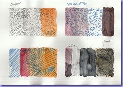
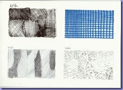
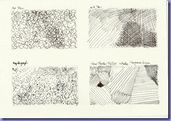
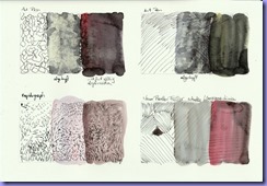
First I used my pens and inks on universal cartridge paper, 160 g/square meter, in boxes made with the template from Module 4.
The scans with the drawings are on the left, the washes on the right.
P 1


           P 1a                           
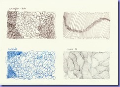
P 1: The Art Pen leaves a very strong line (below left). Washing over it gives a dramatic effect.
The washes are done with walnut stain (brownish) and acrylic ink in yellow and red, partly layered.
The water washes are in the middle.

P 2 P 2a
P 2: Usually I find felt tips too scratchy, but the Pitt Artist Pen is very smooth and lovely to draw with.

P 3 P 3a
P 3a: I like the muted, even dirty shades here. The shellac ink is not entirely waterproof.

P 4 P 4a
P 4: The stippling below right reminds of signs on maps for wood and moorland.

P 4a: Bistre and walnut stain give a very similar colour. The orange wash is watercolour.
P 5 P 5a
P 6 P 6a
P 7 P 7a
P 7: Upper  row right: the grid is also a kind of cross hatch – a very regular one.


P 8 P 8a
P 9

In between I scribbled on thick cartridge paper I had used as a desk cover.
P 9 is Pitt Artist Pen over thick blobs of acrylic.
P 11 is Rapidograph over a wash, P 10 is shellac ink drawn with a metal nib.
P 11 P 10
P 12 P 12a
P 13 P 13a
P 17 P 17a
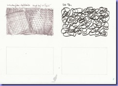
P 17: In the left box I used the walnut stain as ink with the metal nib and the newly bought black Pitt Artist pen on the right. The lower boxes are waiting  to be filled.

P 14 and 15, below: Samples on brown Kraft paper.
The colours turn out even more muted and warmer than on the white paper.
P 14 P 14a
P 15 P 15a
P 16 and 16a: This sample is done on pages from an engineer’s sketchbook, from around 1910. The paper is a little stronger than ordinary copy paper. It is slightly discoloured but has kept well. I like it a lot for its aged quality, and I love the old writing and the swirls the engineer put in between his numbers. The paper is not too thick, so I have to go easy on the washes.
P 16 P 16a

This was fun! I feel I started a collection of reference material. This activity also seems to loosen the hand as a warm up for drawing. So I hope the weather improves enough for me to be able to draw outside around the garden shed.

Dienstag, 26. Dezember 2017

Chapter 2: Experimenting with free standing books


Activity 6.2.1 Searching for freestanding book designs

Loads of fascinating artists’ books! Here are only a few ...

alexsutherland fantasmagoria

Alex Sutherland

left: Fantasmagoria


below: Fecundfields


alexsutherland fecundfields alexsutherland fecundfields3_detail

I love the way he uses boxes to house the books.


kirsten horel 1


An artists’ book by Kirsten Horel.
kirsten horel 2 I like the way text and images continue from page to page. The construction suggests different ways a thought might take.
kirsten horel 3

Detail of Kirsten Horel’s book
   
carol_mankind05
Carol Mankind: A construction with cut papers with interesting folds.
   
Louise Boyd


Zigzags in unusual shapes by Louise Boyd.
   
yunhimook2 yunhimook
yunhimook3 Yunhi Mook and Molly Coy: From loneliness to solitude

I like the two books in one and the combination of text and imagery.
   
Stef Mitchell


A book by Stef Mitchell, again folded in a way that suggests different paths of imagery and thought.
   
Sue-Browns-articleA

Sue Brown

This seems hardly to be a book at all. She incorporates a lot of separate items.

I was also fascinated by the work of Dresden-based artist Marí Emily Bohley (http://www.mari-emily-bohley.de/index.php)

The immense variety of artists’ books I found on the web is amazing, but the more I saw the more I felt stunned and even a bit discouraged. To overcome this feeling of inadequacy I tried to isolate the features I find attractive.
1. I was mostly drawn to books in black and white or in a limited range of colours (which goes well with my chosen theme). 
2. I like zigzags and signatures.
3. I like the form of a traditional book.
4. I feel I would like to use a simple basic construction, with the option of putting in interesting details as they come up.

These thoughts were in my mind when I made the samples.


6.2.2 Sample Display Books

I used decorated papers, mostly taken from magazines and copies from children’s books.

1. Simple concertina book 14x11 cm
 P 2 P 1
A simple zig zag book to get started. The cover folds around the book. I cut the top edges in waves and other shapes.
   
2. Simple zig zag with signatures 7x10 cm
 P 4  P 5
A small notebook-like zig zag, very compact. The book cover which is also the spine is a magazine cover printed with acrylics and a gelli plate. The small red edge on the right is left from the original design on the cover. The signatures with their book-like appearance suggest text to me. What words would I like in my book? I should continue the collection I began when thinking about my theme.
   
3. Concertina with more signatures 10,5x10,5 cm
 P 6 For this sample I folded the concertina first and added the covers separately.

P 8
P 7

Some of the signature pages are also folded like a small concertina.
   
4. Book cover with several concertinas 8,5x11 cm
 P 9  P 10
I gutted an old notebook and glued in a folded piece of card as a spine. I glued three concertinas in the folds and also sewed in a signature.
 P 12  P 13
The concertinas folded out. (It looks like a mutated frog.) The folds of the first concertina I made were too deep and I had to fold them again. The folded spine would allow for a few more signatures and / or concertinas.
   
5. A flag book 9,5 x 18 cm
 P 14  P 15
P 16 I made the flag book just to learn the principle. Although I had read the instructions I did not understand how it would work. Fortunately the instructions are so clear that I could follow them without understanding what I did. It turned out to be quite simple.
I like how the book spreads out to become an image – but one can also turn the pages like in a traditional book.
   
6. A zig zag with signatures on both sides 10,5 x 12,5 cm
P 17 The book cover is made from a thick piece of card, this gives a lot of stability, even when the zig zag is folded out.

I think my finished book will be constructed more or less like this sample. I feel that even with this simple form there are a lot of possibilities for variation and decoration.
P 18 P 19
P 20 Considering that the zig zag will be seen from both sides there is a lot of space to be filled. Quite intimidating!
   
P 23 All my samples
   
Preparation for the finished book: 17x24 cm
P 21 This was a bound magazine from a library, made from very thick and tough bookbinders’ carton. For a start I cut out the pages.


P 22
Could I put in one element on each side? Could I incorporate a flag book element? I am sure planning has just begun …