Welcome

Welcome and have a look at my work for Distant Stitch - Creative Sketchbooks, Module 6, with tutor Lizzy Lewis

In this module I will make a free-standing book on a theme chosen by me - Close to my heart.

Sonntag, 25. Mai 2014

Chaper 3: Kandinsky

3.3.1: Kandinsky research

Information about Kandinsky is abundant in www. I found an extremely helpful website, poulwebb.blogspot.com. Artist Poul Webb shows lots of Kandinsky paintings in chronological order which gives the opportunity to see the development from Kandinsky’s beginnings to his abstract art, quite fascinating. (This blog is a wonderful source for paintings from a lot of artists.)


3.3.2

Look for elements used by Kandinsky in his pictures

I printed some of the abstract paintings in the above album and took notes.


Create your own work in the style of Kandinsky

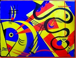
This is my painting, done on A3 heavy cartridge paper. The colours are acrylics: ultramarine blue, lemon yellow, carmine red and black. If time permits I would like to have another try and use a softer colourway and changes of colour within the geometric shapes.


After Kandinsky


The painting “Freudian slip” (see below) gave me the initial idea for the arrangement of the yellow shapes on blue ground. The strong wavy line appears in other Kandinsky paintings as well. I like the contrast of this snaky line to the rectangles and triangles. The small black waves in my painting may be an echo of Paul Klee (I love his work!) I used the black lines with the idea to connect and comment the geometric shapes.

kandinsky-freudian-slip-997x1024


I used to think: “composition is difficult”. But in this activity it followed almost logically from the elements used.  The restriction to primary colours, geometric shapes and black lines was good. Once I stopped feeling limited in my choices the process became playful.

Samstag, 3. Mai 2014

Chapter 2: Creating movement with line


Activity 3.2.1 Draw lines to create an illusion of movement


2-01 calligraphy pen


1. parallel lines – calligraphy pen


2. varied spaces – calligraphy pen
2-02 ink roller, fineliner

3. wavy line – my ink roller needed a new cartridge half way through


4. angled steps – fineliner
2-03 fountain pen

5. zigzags
I used my fountain pen from here on until drawing no 10.


6. starting with small bulges
2-04 fountain pen

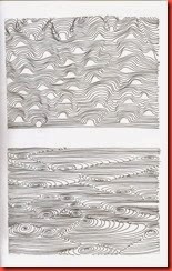
7. strong wavy line


8. random circles
2-05 fountain pen

8 a. random spirals
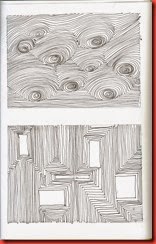
They do not change the overall impression, but add little hollows or tips, depending on which way you look.


9. rectangles – they are too large
2-06 fountain pen
10. occasional bumps


11. lines ending in spirals

I wanted to try stronger lines with varied breadth.
 
2-09 ink and broad nib

12. angular lines –  broad dip pen and ink


13.  lines with steps -   broad cola pen and ink
This drawing makes me think of a piece of cloth with running folds.
2-10 ink and cola pen 14. angular lines, broad and narrow lines
changing directions - broad cola pen and watered ink
This might look better on white paper with strong ink.


3.2.2. Create an op-art picture


2-07 notes op-art, calligraphy pen and inktense pencils

I looked up op-art on the internet only after I had made the drawings for the first activity, and also after I had made the coloured drawing (which in my opinion does not work, as the colour does not add to the sense of movement). The exercises interested me so much that I wanted to go on from there for the picture rather than a work of an op-artist.
2-08 ink and broad nib, A4 heavy cartridge paper

2-08 ink and broad nib, A4 heavy cartridge paper
Above: My favourite variation with the spirals, drawn with a broad dip pen and ink on strong cartridge paper.

It works differently depending on which way it is turned.
2-11 ink and cola pen A3 heavy cartridge paper Two further drawings with a really broad cola pen (about 15 mm). They were fun to do, a very meditative activity, but they do not create much of a sense of movement.


2-12 ink and cola pen A3 heavy cartridge paper  


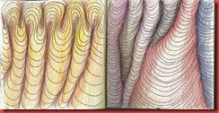
Train doodles This activity is ideal for doodling in my small sketchbook during the train ride to work, with colour added later (fountain pen, inktense pencils, 15x15 cm each).

Freitag, 2. Mai 2014

Module 3: Walking the Line – Chapter 1


3.1.1. Trying out tools and methods of making a line

All the work is done in an A4 sketchbook, if not otherwise indicated. I bound this stitched book using different sorts of paper, including brown Kraft paper which is slightly smaller than A4. Although the book is nothing special I have felt more comfortable working in it so far than with any purchased sketchbook. 


The cola pen is an idea I picked up in a book by Swiss calligraphist Denise Lach, Schreibspiele (ISBN: 978-3-258-60085-7), with inspiring ideas what to do with handwriting. I found cola pens easy to make and good to use if you sand the edge smooth.

With tools like calligraphy pen, fountain pen and dip pen where pressure does not make such a great difference other than grooves in the paper I found that the speed of the drawing the line can vary the character.


3.1.2 Drawings of matchsticks fallen at random

1-16 cotton stick, bristle brush, calligraphy pen, graphite 4B 1-17 pastel, writing brush ink, palette knife, ink, broad nib
   

As you can see I did not so much try to draw a perfect image of the matchsticks. I was more interested in the varied character of the lines. The cotton stick in image 16 up left  renders the dark tips and lighter wood of the matchstick nicely.


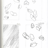
Extra Activity: Drawings of pebbles fallen at random, compositions with different scales

Here also I concentrated on the line rather than on a “correct” drawing. Als I usually tend to draw an image to death, I find this approach liberating.


In both composite drawings I felt compelled to use a variety of lines – fine pencil lines, calligraphy pen, broad lines made with a chunky graphite stick, a wash of graphite, outlines – for the various scales of the original drawing. In the last drawing (image 27) I made a sort of frame with a coloured pencil.


3.1.3 Moods and Feelings in Line


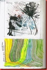
1-18 up confusion, below quiet - working in the garden 1-19 indifference, depression - dead bat
The upper drawing was made with black ink and a dip pen on a print. Lower: water soluble wax crayons. Made with acrylics and the broad side of a credit card,  thin lines made with calligraphy pen. My tomcat had brought in a dead bat from the roof. This gave me the idea for the black heap at the bottom.

1-20 left nervousness, anxiousness - right happiness, lightness, walking

  The left drawing was made with charcoal and sanguine, the right with soft pastels. In the left drawing I think the combination of the lines expresses more  than the lines themselves.

  My colleague who saw my sketchbook and was very interested asked me: You are not really in such a bad mood, are you? Fortunately, I was not.