Chapter 8: Matisse and Colour
8.1 Find out more about Matisse
I was astonished that I did not find any books about Matisse in the public library. (I will have to buy one eventually.) Meanwhile there is a wealth of images on the web, particularly on www.matisse.net, a very informative site with examples not only of his paintings but also of his drawings, paper cuttings and sculpture as well as a lot of background information about his life and his work.
His paintings often appear spontaneous to me, but he worked very hard to create this quality, made lots of studies and grappled with the painting until it reflected an emotional truth rather than outward appearance. I saw on the web that there is currently an exhibition in the Metropolitan Museum of Art in New York, “Matisse: In Search of True Painting” – it would be great to see that!
http://www.metmuseum.org/exhibitions/listings/2012/matisse
Some of my favourite Matisse paintings (I have finally discovered Sky Drive – it makes handling the photographs much easier):
8.2 Still life using a photograph
I looked at the paintings before reading about Matisse and liked “The Blue Tablecloth” very much. He painted it in 1919, and it shows his interest in ornament. The ornaments on the tablecloth are quite as important as the jug, the bottle and the fruit.
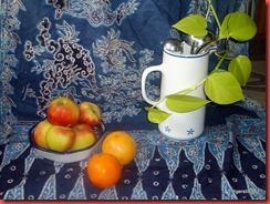
Arrangements for painting:
My choice for the painting:
“My” blue tablecloth is a gift from Bali, given to me ages ago. The blue colour is partly faded.
I set out printing an A4 copy and traced the outlines in my sketchbook as described in the Module, but I sat down in front of the original arrangement (on my living room /studio floor with much interest from my cats.)
Using acrylics I started, a little daunted by the ornaments, but they proved much easier to paint than I had expected. I blocked in the main areas with lighter and darker blue (sea blue with a little ultramarine and burnt umber), left some of the white from the background and added white lines afterwards for more detail.
Painting was so absorbing that I completely forgot to take photographs in between. So here the finished study.
As you can see, simplification does not come easily to me. Concentrating on the spaces and their ornamental qualities made painting them much easier, I noticed that especially when doing the spoons in the jug – dabs of lighter and darker greys and a little white. I like the warm colours of the fruit in the cool context and added the stripe of orange/ochre in the background to repeat the colour.
There are a few things which might be improved, for instance the green of the apples which should be more yellow, but I decided to stop fiddling.
8.3 Paint a still life from observation
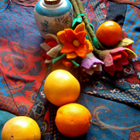
After working on the A4 scale of the sketchbook I felt I would like more space – a lot more space! So I took a 50x70 cm canvas and set out with my acrylics in my kitchen. I had been given a bunch of yellow tulips which I absolutely wanted in along with fruit, a blue napkin and one of my patterned papers as part of the background.
Perhaps it is our very cold spring which made me want to put a lot of yellow in the painting: tulips, tablecloth, bananas.
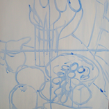
So here my progress, beginning with the first outlines.
The blue lines can stll be seen in some places (the red apple for example). I used burnt umber to shade some of the colours, especially the yellow in the bananas. I changed the background twice and muted the colour of the grapefruit. At first I did not want to paint the ornaments on the tablecloth, but the yellow space looked too bright - and empty at the same time. I lightened up the yellow with a thin wash of white and added the ornaments after all.
I wanted the perspective to be slightly askew, a mixture of looking down and sideways at the arrangement. My favourite is the milk jug! It looks like it is giving the vase and the flowers a piece of its mind.
After I had spent a lot of time on the canvas I painted very quickly a watercolour sketch of the arrangement to get back a little lightness.
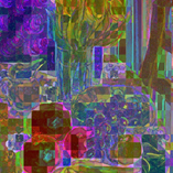
Some variations (done with Picasa) – a lot to explore!
I like the HDR-Versions of both paintings a lot.
The last photos are variations on the milk jug.
Chapter 9: Arcimboldo
9.1. Research work and create a face in homage to his work
I found a lot of references to Arcimboldo on the web – most of them in an educational context. A lot of websites show instructions how to work with children in the manner of Arcimboldo. Not many details about his life seem to be known, but apparently he worked in a lot of capacities at the Habsburg court in Prague, arranging court masks etc. He must have been a very versatile artist.
I like the librarian!
When assembling the vegetables I found that each piece has its own characters which adds to the final face. I tried to use photographs as well, but did not like it. The three-dimensional vegetables give a much livelier image – perhaps I just do not have suitable photographs.
Chapter 10: Zigzag Books
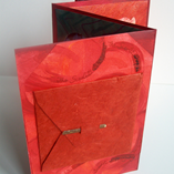
I folded a sheet of A2 cartridge paper, 190 g/m2, very sturdy, as in the instruction to get 4 pages on each side and painted the margins of the pages with red acrylics. Red is my chosen colour for this activity, and I wanted to create a unifying frame.
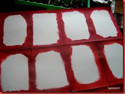 | The whole sheet spread out and painted. The pages are A5 in size. |
Preparations for the pages and work on the side:
- new colour: Magenta
 | How could I miss this colour for so long? It is wonderful for mixing. |
 |
- colour matching of a favourite photograph
- more coloured pages
 |  |
Left: thick acrylic paint was applied in whirls and left to dry a little, then washed over while still a little wet.
Right: acrylics with cling film, a strip of printed paper used to cut out a fruit shape
- colour wheel of watercolours
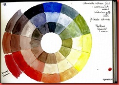 | 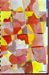 |
 | I found this photograph of strawberries in a catalogue and wanted to use watercolour. The other half of the image above is in the zigzag book. |
- more fruit templates, printing and cutting out
I hope the photographs and scans give you an idea of the finished zigzag book.
I felt that the red needed splashes of other colours to set it off, so I put in some green, a little yellow, and some very dark shades of red-violet to give contrast.
Apart from my own photographs I used a collection of images from a fashion catalogue (for the strawberries on page 3), coloured papers from my first activities and some I had made for this one. Collecting the coloured materials was the first step, the ideas what to do sprang from handling the papers, sorting them etc. Without planning this I finished concentrating on shapes and images of fruit and vegetables, thus the title, a shopping back from the market. The photograph in the letter on page 1 (an old gift envelope made from Indian fibre paper) is a coloured specimen of swiss chard.
The zigzag book stands very well, as the sturdy cartridge paper is further strengthened by the images glued on it. I glued the seams of the narrow edges together, but not the bottom seam, because I think this would take away necessary flexibility.
Time taken: 12 hours
Cost: 1,25 € for photographs
All the other materials were taken from my stock.
_____________________________________
Records for Module 1
Time taken:
I only recorded the time for the final activity. In the beginning of the module I am afraid I lost track.
Cost:170,99 €
for printing photographs, colours, pencils, sketchblock, glue, vegetables for Arcimbolo picture)
I did not think it would amount to so much, so it’s good to see this.
Health and safety:
- Caution and a good mat when using the cutting knives
Storage:
- I store photographs and other sources up to size A 5 in a shoebox, sorted according to subject matter, colours etc
- larger papers are stored in boxes according to size
- colours and pencils are stored in transparent ice cream boxes, pastels in drawers, brushes, scissors and knives in jars


