Welcome

Welcome and have a look at my work for Distant Stitch - Creative Sketchbooks, Module 6, with tutor Lizzy Lewis

In this module I will make a free-standing book on a theme chosen by me - Close to my heart.

Donnerstag, 19. Februar 2015

Module 4, Chapter 3: Drawing textures

4.3.1 Making wax rubbings

My sketchbook is size A4. Papers and media are indicated on the images.


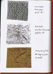
01 Rubbings The upper rubbing was done directly in the sketchbook. Although the paper is a little too thick for rubbing, the edges of the lime are well visible and make a nice pattern.

Most textiles were too soft to get a good rubbing. One exception was a woven table mat. Neocolor II was good to use with this finer texture, as it is less soft than the Jaxon oil pastels I used later on.
   
02 Rubbings A wickerwork try offered several opportunities.
   
03 Rubbings My favourite earthenware mug in two media. The graphite stick renders the details differently, with more shades than the Jaxon crayon.
   
04 Rubbings Done with Jaxon, the rubbing of the oven cloth was a smear. But with the graphite it is quite distinct.

The two lower rubbings were taken from a paper made in Module 2. The graphite version renders the lines, the Jaxon version shows a combination of line and plane.
   
05 Rubbings Again a graphite and a Jaxon version.


The woven basket has a very fine texture, so I preferred the graphite stick for the rubbing.
   
06 Rubbings The texture gets more dramatic with the 8B pencil.


I wish I had more of this very thin tissue paper. It is ideal for fine details.
   
07 Rubbings Two more trials with textiles, done on the very thin paper, as well as the shell on the right. I wrapped the shell in the paper repeatedly to make the rubbing.


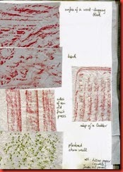
08 Rubbings For outside rubbings I raided my neighbour’s garden shed, as it had been raining for days and everything outside was soaking wet.

These rubbings were all done with Jaxon wax pastels and sturdier tissue papers.
   
09 Rubbings I like the bark rubbing, the second down on the left, with the delicate traces tapering away from the strong marks.
   
10 Rubbings The feathers have such a delicate texture that it can hardly be seen, although I tried several times. Yet I like this page.


Extra activity: adding colour washes and making a collage design


1 Collage The papers were coloured with washes of acrylic ink. The image appears rather pale on this page, the original is a lot more colourful and shows more contrast. 
   
2 Collage The snippets are arranged on a paper from Module 3, prints and colour washes on woodchip wallpaper with a texture of its own.


4.3.2 Looking for texture


For many years I have collected photographs  and filed them in theme folders like stones, trees, houses, sky and so on, but also colours, lines – and textures. It seems there remain a lot more texture images to be collected!


4.3.3 Drawing texture


Some of the textured objects I used for my drawings (except the white shirt):


Textured objects


The first page of the drawings was done on a sheet in my sketchbook which I had coated with gesso, so the surface is a bit grainy. Except for the oyster shell I used pencils, as indicated below the drawings.


1 Drawn textures Upper left: oyster shell
I had experimented with Brusho and bleach and tried it again here. The bleached lines are almost, but not quite, definite, an effect which I think suggests the mother of pearl surface of the shell.

Upper right: sunflower head
The grainy paper was not the best surface for the fine details of this object. Yet I like the contrast between the regular pattern and the burst at the centre.


Lower left: The paper was not bad here, because it gave the lines a hint of movement. The H5 pencil was a good  choice for the fine lines of the very light wood. Lower right: This stone has no regularity and was difficult to draw. I went from dent to dent and made the graphite wash in the background to make the shape a little clearer. 


The next two images show half a sketchbook page each.
 
2 Drawn textures Sock: I hope it is evident that I knit the sock myself! Incredible to have done so much knitting and to still have to look very closely at how the stitches are connected. Sometimes I think I do not see an object properly unless I draw it.

Snail’s shell: Something went wrong here. I was bored while drawing the shell, and the drawing is boring.
   
3 Drawn textures Brush mat: I thought this is perhaps too simple and regular a motif, but I liked to explore the spaces between the bamboo sticks and the thread that holds them together.

Wasp’s nest: Once I understand a pattern I tend to draw what I know instead of what I see. But the wasp’s nest has so many irregularities that I always had to look closely. I might have made the dark spots blacker.
   
I played a little with these images in Picasa.  

Reversed colour: I especially like the effect in the sunflower and the wood.

HDR processing: The wasp’s nest raises from the page with the enhanced contrast. I might try to draw with a calligraphy pen or a felt tip to get a similar effect. Or an inktense pen with a wash for the darkest shades (the idea comes only just now during writing, too bad).
4 Colour reverse

5 HDR processing


Finally: A little relaxation


The painter Mary Fedden (I cannot thank Viv enough for drawing my attention to her!) used to make little soft lions for the babies born to her family and friends. They are so lovely that I decided to try one for the new born daughter of a friend. It was so relaxing to sit back and stitch for a change! It was also a chance to finger much-loved old textiles again and turn them into something nice. This won’t be my last lion – my little grand niece will get one, too.


Golden Lion 2

Freitag, 6. Februar 2015

Module 4, Chapters 1 & 2 – addition

The very best idea for my story has only surfaced after I had posted Chapter 1 and 2. So here are a few new line and tonal drawings for further use. All the drawings were done on 220 g cartridge paper.


1. Walking boots

1-SANY6467 3 Schuhe
4 Schuhe
My walking boots again. I will need this profile view.

Both lines and tones were drawn with B6 pencil.


2. Gun

 
Gevär_m-1896_-_Modellexemplar_tillverkat_1896_-_6,5x55mm_-_Armemuseum 1 Gewehr

The photograph of an old gun is from the internet. I don’t know the first thing about guns, so I hope I got the details right. The drawing is too long for the scanner, so I did two scans and made a collage in Picasa, that’s where these awkward lines come from.

2 Gewehr

Drawn with a B6 pencil, lines and tones.

3. Butterfly

 
5 Bläuling 6 Bläuling
A common blue, as I learned from the field guide I used for this drawing. B6 again


4. Field edge

 
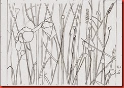
1-Kornfeld Among the many photographs of a field edge with poppies, this seemed the best. Even so, the thought of drawing all these stalks in the background was intimidating.

7 Feld

In the line drawing I picked out just a few of the stalks to create an impression of the field behind and around the poppies.  Drawn with B6 pencil.

8 a Feld Zwischenstadium

An intermediate state with the tones in the poppies and the background, drawn  with a B9 pencil. This may perhaps be useful further on.

9 Feld fertig

The finished drawing after a lot of work …
I used a kneadable eraser to make  lines in the background and suggest the mass of stalks in the field. I also added  tone to the outlined stalks and the background to set off the poppies. The prickly poppy stalks against the light are not done quite successfully, but on the whole I am satisfied enough to stop at this point before I work it to death. 
   

I am so sorry that I cannot use the images of these wonderful red shoes in this project! But I am resolved to work on with my first idea some other time.