Chapter 3: Drawing with glue
Activities 2.3.2 and 2.3.3.
Making rubbings of glue drawings and adding washes to wax rubbings
These two activities just ran into each other, so I present my work in one chapter.
I wrote with a bottle of household glue on sheets of acetate for overhead projectors and on plastic folders. It took a little practice to get the glue to flow smoothly. The glue flattened out a little during the drying process, so I added more glue on one sheet in places where it had become too flat or where bubbles had burst and left a hole. These bubbles came when I began writing, so it was good to get the glue flowing before starting on the sheet.
For rubbings I used graphite, coloured pencils, oil pastels and oil sticks, both coloured and transparent.
Graphite and coloured pencils rendered the letters more clearly, the softer media gave more painterly results and the writing dissolved into texture, especially when I put colours on them. I used water colours, gouache, acrylics and inks for colour washes.
Papers used: old letters and lecture scripts from work (good), copy paper (a little too rigid), tissue paper (very good! glued on copy paper for the colour washes), wrapping paper (very good), pages from an engineer’s script books (they are about one hundred years old, in old lettering with drawings and mathematical symbols, a treasure). I liked working with newspaper (no 53 and 57), as it is soft, brings its own colours, and the crinkles add to the texture.
Sometimes (no 52, 53, 55) I scratched the colour away over oil pastels and oil sticks. I found this a good means to give emphasis and enhance contrast. I also like the additional texture left by the scratches. In no 56 I made the rubbing in two stripes down the paper and scraped the colour washes away with a palette knife.
It was important to keep the acrylics and gouache fluid enough to trickle into the little spots left open by the reserve materials, otherwise they just covered everything. The watercolours however may soak the paper and crawl under the letters.
The inks used in the last image (with no number) gave a good contrast. It might look better if I had not used so many colours. I muted them with a wash of blue watercolour. Contrast was always a thing to keep in mind – I often forget it.
Extra activity: writing with glue on paper
I struggled quite a bit with my impatience while working for this chapter. The rubbings had to kind of settle before I could go on, the glue took ages to dry …
Presented like this my work for Chapter 3 does not look like very much, although I spent no little time doing it and feel I have learned a lot about the way colours and materials work together. The temptation is there to go back to this chapter and try to fill in the holes, but now I have moved on it does not feel right, especially as my time is more limited since I started working full time again. So I let it stand, although I am a bit disappointed with myself.
Chapter 4: Take a letter
Activity 2.4.1: Creating patterns using a letter template or pattern
 | These are the letters I started with. T, W and L are 5x5 cm, H is 7,5c5 cm, Y and A 6x? cm. The H was chosen for its chunky form. |
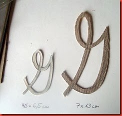 | Later on I made these G’s, from a font called French Script. |
Different ways of placing the letters in the grid:
Extra activity: Working with fragments of letters inspired by Rosalie Gascoigne
I had never heard about Rosalie Gascoigne before. Thanks a lot for pointing her out, Viv! I found out about her life and work on www.australianbiography.gov.au/gascoigne/bio.html, among other webpages – praise be to the internet. The way she put found things into use in her work is quite amazing, I love this sensitivity.
The spiky letter A was lovely to use here. I was in doubt about the white spaces in no 72, but now I think it leaves some air in the design and adds to the contrast.
In the grid no 71a I used the letter G in both sizes, and in the coloured version 71 I added lines using the W. The sheet reminds me of a tree stripped of leaves and I wanted to add some spiky twigs, but now I think I should either have left them out or blackened the lines. This way it looks indecisive.
Activity 2.4.2: Rotational patterns using a letter template
For these examples I used the large letters B and G. It was quite amazing how patterns built up from beginnings that did not look very promising, especially in the center.
The form in no 68 reminded me of a winged horse, but the black makes a hole in the design, I should have chosen a dark blue perhaps, or even better a burgundy red. When colouring no 69 I thought: Why not put in some shading? The result seems to have a three-dimensional effect.
Side-products








Keine Kommentare:
Kommentar veröffentlichen