Chapter 7: Jasper Johns
2.7.1. Find out more about Jasper Johns
 | With some pictures of Jasper Johns’ number paintings downloaded from the internet as reference (and the reproductions in the manual) I noted some of my observations. |
I wondered how Jasper Johns defined the forms and created contrast. Enlarging the images I found pieces of print under the colour and thought about using bits of newspaper in my painting (did not do it though). In this stage I imagined how it would be to paint in this way – in the end it was quite different.
These are the two paintings I used as reference, one for the application of colours, the other for coherence.
 |  |
2.7.2 Create a painting in the style of Jasper Johns
I wanted space for this, so I did not divide a page of my sketchbook, but used two opposite pages. Each letter is A4. I hope it is okay that I painted two letters, not four.
 |  |
 |
I made this collage on Picasa to present them side by side. I think they correspond quite well. |
I used colours straight from the tube without mixing: prussian blue, ultramarine, turquoise, red, yellow and white. For application I took brushes, a palette knife and pieces of old credit cards in different widths, which were very versatile for applying thick coats of colour as well as thin scrapings. They also made ridges of colour which help define the letters and add texture.
I started with dark colours and applied the lighter colours on top. Colour mixing happened on the sheets with the paints still wet or when I scraped colour thinly over another. The scan does not show the tints and shades too well. I tried to create contrast by placing light against dark colours and thick coats against transparent scrapings. Applying white made a lot of difference.
The letter G (which had started out as C) was too large which made me notice the space around the letters. I also tried to break up the contours of the letters and let the colour spill over to the space around them, so the mind completes the form.
It was very interesting to see that the process of painting was different from what I had imagined, much more controlled, and I liked the dialogue that happened as I went along: a blob of yellow belongs here, a little red wants to be there ...
Like in Module 1 in the Matisse chapter I felt intimidated at first (Paint in the style of Jasper Johns?! Me??), but once I started it was really thrilling.
Chapter 8: Using your camera
2.8.1 Make an alphabet in photographs
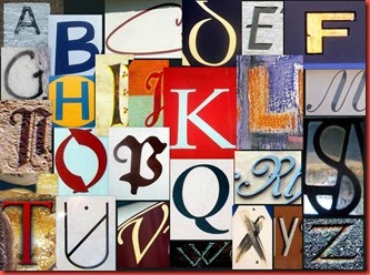
I wanted to make one alphabet of letter shapes and one of found letters. One self-imposed rule was not to make arranged shots, another was not to use the same source twice.
All but seven of the photographs for the alphabet of letter shapes were taken during a recent Sunday stroll in lovely weather (which gave a lot of shadow shapes to observe). I took my camera “just in case” - and returned with a surprising heap of shots, several for almost every letter. Once I started looking there was no stopping. And it is still going on …
The letter A looks man-made, but it is a stone formation, an amazing find. My window sill also provided material, like B, a dried garlic stem, and the amaryllis V. The letter R is a good example of how shapes presented themselves: I saw it in my camera display when I considered the pole on the left for the letter I and wondered what the dark blob on the right was doing there.
I also reviewed old photographs and found the Y shape, a funny shower contraption seen in a Scottish hotel during one of my walking tours.
For my alphabet of found letters I went back to the collection started at the beginning of Module 2. But I also made a couple of new photographs and scans. Being a great fan of Tolkien and Alan Lee I especially like the T, scanned from the cover of “The Hobbit” (you can just see a glimpse of Smaug’s body on the left).
One result of this chapter’s work for me is an increased awareness of the wealth of design sources in my everyday surroundings. And I am pleased that my simple camera can do so much.


Keine Kommentare:
Kommentar veröffentlichen