Chapter 1: Fantastic Fonts
2.1.1 Find fonts on your computer
Of course I have the usual collection of fonts in my writing programme, but it was fun to browse the free font websites and discover a wealth of interesting fonts in all kinds of styles. I downloaded a few, especially some “gothic” varieties like “A theme for murder” on image 01 in the “Fonts” album and celtic styles. I also like the fonts which are almost unreadable, like “Uncial most Irish” or “Lyssa” on image 02. There are so many I feel I have hardly started to explore them.
The “the strandline is the dark tangle left behind” is taken from this wonderful book I bought on my walking tour in Cornwall – loads of inspirational photographs and words.
My writing program at work also offers some lovely fonts which I printed out for reference on images 03 and 04.
For printing on a range of papers (see album below) I used some of the coloured papers from module 1, office paper, old envelope, brown Kraft paper, cartridge paper. I tried to print on tissue paper glued on a sheet of printer paper as suggested, but my printer is very picky. So I used a sheet coloured with oil stick to transfer the letters (image 09).
I like the differences of the print on pre-coloured papers. Gouache and pastel soak in the ink, acrylics act as a resist and the print will blur when brushed over.
The little poem “I would love to live …” was written by the Irish poet John O’Donoghue.
The “dark tangle” generated the idea to make the little printing block shown on image 10 with onion net and string.
2.1.2 Topsy turvy printing
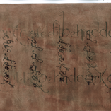
Again I used a papers coloured in module 1, old business letters, an old map and paper brushed with leftover acrylics (image “Courthand Anglosaxon”).
The interesting shapes of some letters gave me the idea to make patterns by placing one letter quite closely (images 12 and 13).
2.1.3 Collecting words and letters for inspiration
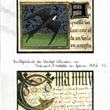
Since I started working on this module I find myself much more attentive to letters in everyday life. Among snippets from journals, brochures, paper bag, old children’s writing I found two beautiful postcards from ancient books. I also noticed beautiful lettering in the manufacturers’ labels in art supply catalogues.
Some of the photographs I took around home and on a cycle tour. The collection is growing …
2.1.4 Collection of recycled papers
My cats had a wonderful time when I emptied my two big boxes of collected papers on the floor and started to sort them. It contains gift wrap, old scripts from an engineering school, LP covers from the seventies, magazine pages collected for colours or patterns and all sorts of other things. Finally they come out of the attic!
Chaper 2: Handwriting
I loved the excuse to go shopping and bought some new materials like coloured inks (50 ml bottles in the basic colours, they are so intense that they go a long way) and a calligraphy pen (Rapidograph .35 mm).
2.2.1 Handwriing to fill and decorate sketchbook pages
This is really fun and keeps me occupied forever.
I have used ink pen, ink roller, calligraphy pen, cotton stick, felt tip pen, charcoal, pastel, oil pastel, wax crayon, water soluble colour pencil, industry marker, dip pen, sponge roller, eye dropper and various brushes (I’m certain I forgot something).
Looking at Leon Ferrari’s work gave me the idea to make my handwriting “unreadable” and move the design more towards a pattern. So I experimented with using charcoal fixed to the end of my walking stick (image 28), writing with my left hand, writing from the right to the left, taking prints from wet writing etc.
Looking at the sheet 35 a I was reminded of the elaborate initials in medieval manuscripts (another inspiration when it comes to letters) and added more intense colours, a little silver ink and text to end up with image 35.
The texts were taken from Daphne DuMaurier’s book “Vanishing Cornwall” which I found in a second-hand bookshop on my walking tour, and from the half-way stone on the South West Coast Path in Porthallow. As you can see Cornwall is still very much in my mind.
2.2.2 Handwriting patterns
I made the Rapidograph image first thing after unpacking my shopping bag. I could not wait to try out my new inks and the new pen.
Unfortunately my drawing program does not have a symmetry button, so this extra activity has to wait for the time when I find another one.
Train doodles
To get to work and back home I am on the train each day for some time. I find that writing in public is much easier for me than drawing, so I have begun to use the time to work a little in my small sketchbook. In the train doodles 7 and 8 I glued torn pieces of old business letters on the page for a starting point.
I often wrote several layers with lead pencil, charcoal and calligraphy pen to create a texture on the page with smudged and clear markings – inspiration from Leon Ferrari’s work.
The poem “Spell of the bridge” which I used quite often here was written by Helen Lamb. I also wrote down words of conversations around me or words that come to my mind when I look out of the window.
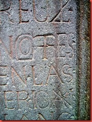
I took these shots on a walk recently. I like the way the stonemason connected letters in the left photograph to make the text fit into the available space.
 |  |


Keine Kommentare:
Kommentar veröffentlichen