First a little extra: variations on gray
Taking up Viv’s idea from her feedback I placed my gray cards on varied backgrounds.
 |  |
 | 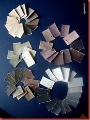 |
The phtographs are not very good (also my cats were eager to play with the pieces), but the difference in the impression of the colour is still striking. Thank you, Viv, for the suggestion!
Chapter 6: Colour matching
6.1 Match a picture
This is a catalogue photograph of a cocoa fruit. I chose it because of the lovely red tones.
The small painting on the left (A5) was my checking instrument in the search for the colours. When I thought I had “got” one I filled it in. It proved very helpful for keeping track of the colours.
 |  |
The red is my version of crimson with the addition of a little ultramarine, the shade down left was done with sea blue. I had to add more black than I thought to mix the darkest shade. The range of greens on the photograph is surprising, as always, and I do not think I got them all. For the dark gray in the twig I used red, ultramarine and black with very little yellow, for the light gray ultramarine with a little green and white. There is also a warm grey in the twig, for which I mixed red and green (leaf green from the tube). Of course with so many reds and greens there is good material for all sorts of greys.
6.2 Pattern using the colour palette
 | After I had drawn the lines with transparent oil pastel I noticed I could not see the spaces – so I added a thin pencil line to help. |
Extra activity: variation of colours
I became aware a little late that my original colours were mostly complementary – red and green. So a couple of the suggested variations were not so promising.
 | Light and dark colours swapped in larger shapes with fewer lines. I think the changed spacing makes the real difference here. |
I wanted to make a greater change in the painting, so I chose colours two steps away on the colour wheel.
lighter tints and darker shades to get more contrast. I notice that I tend to lose this aspect, and the result can be boring even if the colours are nice enough – a very instructive experience.
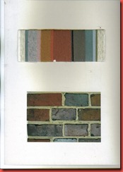
I remembered that many years ago I tried colour matching with threads, inspired by Jan Messent’s “The Embroiderer’s Workbook” from 1988. I have still kept the cardboards on which I had mounted the results.
 |  |
Chapter 7: Printing
7.1 Fruit/vegetable print
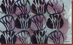
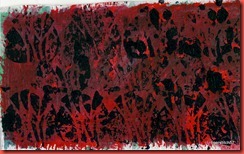
I cut a fennel in quarters lengthwise and printed with this. I like the wavy lines of the sections and the way they can be combined to patterns, also the piece is big enough to paint a range of colours on it. As advised I used acrylics for this activity (unless otherwise indicated).
The first two prints and the right one in the second row were done on my coloured papers.
 |  |
 |  |
 | 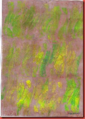 |
For the other prints I used white paper. Some were painted over with a colour wash when dried, and I dabbed away the wet wash in parts with paper tissue.
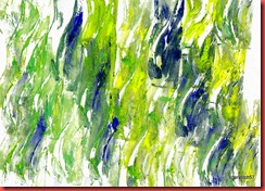 | 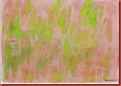 |
 | Left: printed on leftover cuts of Canson mi-teintes, glued in my sketchbook. That was actually a way to use up leftover colour, a happy accident. |
One more happy accident: the last drops of another palette
7.2 Potato print
After working with the fennel I found the potato a bit wet, but I left the pieces on a paper towel for some time.
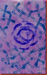 |  |
 |  |
 | 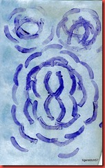 |
 | I found that a wash of background colour always added depth to the pattern. |
7.3 Make repeat patterns with a card printing block
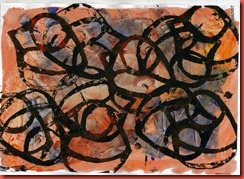
My choices from Chapter 5, not surprisingly:
I found printing enormous fun – and I feel I have only scratched the surface of a huge range of possibilities. A hard piece of rubbing gum is currently waiting on my work table to get cut. I think it will make a good printing block.
Acrylics have never been my favourite colours, but during this activity I got better acquainted with their possibilities and quite warmed up to them.








Keine Kommentare:
Kommentar veröffentlichen