After a long pause - going on holiday, saying goodbye to one job and starting a new one - I have finally come back to a daily rhythm to do the course work for Module 1. So I hope it will not take me quite so long until I can post more work.
Chapter 1: Painting basics
I included gouache and acrylics in both a cool and a warm colour set in my basic kit. Until now I have not done much with these colours (I like watercolours, oil and pastels), so this will be a good opportunity to get to know them better. As a start I painted them all on the first page of my sketchbook.
 |  |
My folding pin board with some of my fruit and vegetable photographs and sheets of paper (discarded flyers) which I use to wipe the brushes or clean the paint tray. The “exhibition” is always changing – since I started taking photographs for the course, more and more colourful details in everyday life catch my eye.
Activity 1.1: Create a range of marks on your page
For this activity I used large sheets (A 2) of leftover flipchart paper, wrapping paper, Kraft paper (brown), watercolour paper, a tube of gouache crimson and a range of mark making tools: brushes in all sizes, a baking brush, foam brush, foam roller, glass and metal nibs, a bamboo nib, a small twig, a dried sage twig with leaves, credit card, a toothbrush, a painting knife, a pocket knife, a wooden wedge, natural and man made sponge, a comb, cardboard rolls, cork … I may have forgotten something.
 |  |
 |  |
 |  |
Some of the tools are good for bringing a quantity of colour on the paper, like large brushes, foam and sponges, others do not carry a lot of colour, but are good for spreading it around on the paper and create patterns, like comb, twigs etc. I filled 8 large sheets with marks and still feel that I only just started exploring the possibilities. So this “library of marks” seems to be a lifelong work in progress.
Activity 1.2: Observational painting of a lemon
Mixing colours
Activity 1.3: Combine two primary colours to create a range of secondary colours
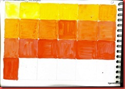
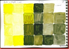
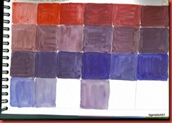
These pages were all done with gouache, using warm and cool colours.
 |  |
 |  |
Activity 1.4: Mixing with black and white
 |  |
The tints of carmine above remind me of all sorts of ice cream and fruit yoghurt, the shades of blackberries and eggplant. In addition to the shades of yellow I diluted the paint with varying amounts of water.
The colour wheel
Activity 1.5: Paint a colour circle
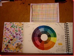
In every colourway there are one or two colours which are more transparent than the others and have to be mixed with care or else they are totally overpowered.
Since I painted the colour circles I get back to them again and again for reference. So the time was very well spent.
Extra activity: Making a colour circle with found objects
 | Collage of details in my sketchbook page 21 |
Chapter 2: More Colours
Activity 2.1: Use complementary colours to paint patterns
+ Extra Activity
Painting these shapes reminded me of filling in shapes in painting books as a child. I did not have to worry about “getting it right”, but could concentrate on the colours. A very meditative experience, I liked it a lot. It also took quite a lot of time, more than I had expected. I always set down painting as fast work in contrast to time-consuming textile work, but I find I am mistaken.
Activity 2.2: Optical colour mixing
Activity 2.3: Use analogous colours to paint harmonious patterns
Extra acitivity: Overlapping shapes and grid in complementary and analogous colours
This is a fun exercise! There are details which make me think of knitting or cross stitch. I already went over the two pages with a frame viewer to isolate interesting areas. A red to violet colourway would also be nice to try out. And – and – and …


Keine Kommentare:
Kommentar veröffentlichen