After three weeks holiday I am now back to my wall, posting the work I did before I left.
The task in chapter two is: Record your observation of the wall. I did that while taking the photographs, so I now have a lot of rubbings in my sketchbook from pieces of wall I did not choose to work with.
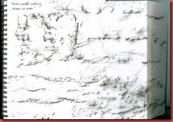
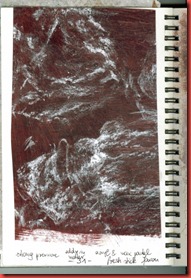
First there is a look back to page 5 & 6 of my sketchbook with a little drawing added of the prints left by fossils in the stone.
I used conté pastel in two colours. I find the marks interesting, but the stones do not offer the material I need for this project. I included them – like everything from page 1 to page 8 – because I like them and for other ideas they might spark off.
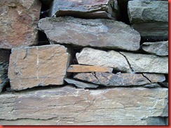
Here on page 9 is the piece of wall I finally chose for further study.
 | I like the irregular shapes of the stones, the interesting spaces between them and the lovely colours. The stones also have distinct surfaces and little features like the break lines on the right or the grey-white streak in the middle one.
This photo has been taken in full sunlight (and I have manipulated the colours perhaps a little too much).
|
Rather than manipulate the photo further I took another photograph in cloudy weather. Fortunately I could keep the camera still and have a much sharper shot now.
 |
The colours are more subtle here, lovely shades of grey, grey-blue, rust, ochre, lavender, dark blue and more.
The spaces between the stones are more than just negative spaces.There is colour and texture fading back into the dark. I like the idea of translating this into stitchery. |
I took rubbings from some of the individual stones with tissue paper and a 6 B graphite mine. I used a lot of pressure and rubbed intensely in an attempt to feel the texture of the stones through the paper. The result is very detailed, sometimes too dense, like the one on page 12 below.
 |
Page 10 - 14
The result is very detailed and sometimes too dense, for instance on page 12. My favourites are page 11 for the suggestions of stripes in various textures, and 14 for the many little circles appearing in the rubbing. |
I traced the negative spaces from the photograph to sandwich paper and numbered the stones (page 15 upper).This was not yet intended as shape observation but as a way of keeping order.
The print with the tonal reduction done on the computer (page 15 lower) was made for comparison – do I have to do it all by hand? It seems so.
Another little sidetrack on page 16 lower: The print gave me the idea to spread viridian ink and a layer of black oil pastel over a ground of reddish and brown wax crayons and scrape the layers away. The viridian ink was not a good idea.
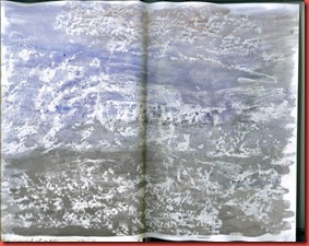
 | Page 17 + 18: One of the initial rubbings of “my wall”, done in black an silver wax crayons. The marks are loose and airy in comparison to the graphite rubbings.
I could not resist the temptation to flood it with watercolour. |
My wall in clouded weather with torn leftovers from papers I had coloured for further work (see pages 29 to 31 below).

|
First rubbing done in conté crayon on copy paper.
 |
Page 21 + 22
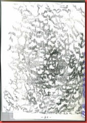
I was curious to explore the texture caught in the graphite rubbings (this one from page 14) a little more. So I made enlarged fotocopies. I coated a sheet of drawing paper with black oil colour, placed a blank sheet of slightly lighter drawing paper on it and the copies on top. I traced the features that seemed important to me with a ballpoint pen. The lines of oil colour (page 21) are a bit blurred and have a textural feel.
While doing this the zigzag motion of my hand reminded me of a sewing machine doing zigzag stitch. Perhaps an idea for machine stitching on soluble fabric?
 |  Page 23 – left Page 23 – left
A copy of page 21,
the little circles
were burned with a
soldering iron. The sheet was washed with water soluble graphite.
Page 24: I intended the coloured paper as a background for the piece on page 23, but there was not enough contrast. |
 | Page 25 + 26: Same method, tracing over oil-coloured paper, done with the blunt edge of a bone folder and the rounded tip of a brush.
Both were taken from the rubbing on page 11.
I like the suggestion of stripes in different textures. |
Following Sians suggestions I worked with rubbings on coloured papers. (I should have read the instructions in the module more carefully!)
Page 28 + 28 a:
Rubbing taken with transparent oil pastel washed with watercolour on copy paper |  |
 | Page 29 + 29 a: On acryl coloured tissue paper (feels very interesting, thin and supple but resilient), made with a wax crayon using very light pressure. |
 | Page 30: Wax crayon on acryl coloured wrapping paper which was already rather crumpled, giving additional texture. |
 | Page 31: Definitely the last rubbing! Done on acryl coloured copy paper with a fresh wax pastel stick which gives off colour generously. The marks look like eddies in water, separated by quiet spaces. |
I spent a lot of time working with the rubbings and exploring the texture. It was a lot of fun, also the experiments helped me to clarify my ideas of what I could use for further work in the module.
Still I could have saved time, I think, with a little organisation. It might have been useful for instance to make a list of suitable colours and papers. I will try to keep that in mind when starting to work with colours in the next chapter.
And: read the module carefully – read the module carefully – to be repeated.


