First a second variation of the last activity. I have always thought of blue as my favourite colour but during the coursework I find red and its variations very appealing.
 | I used several templates to make the shapes, an onion, a tomato and a pepper. The overlapping shapes are more varied, at the same time the grid appears more clearly. |
 | And a new warm yellow: cadmium yellow light, mixed here with ultramarine blue and black. My middle yellow is slightly orange which shows in the mixtures. |
Chapter 3: Light and Shade
3.1. Use paint to make a range of different grays
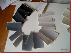
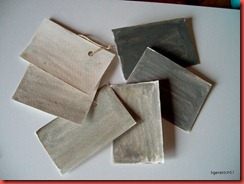
For this acitivity – mixing grays using combinations of primary colours, complementary colours, black and white and water in varying proportions – I used acrylics. After mixing for some time it became difficult to keep track of the combinations. I doubt if I could ever reproduce exactly the same colour, although I noted the combinations on the backside of the cards.
When I thought the arrangement made sense I gathered the cards on cord rings. The black and white mixtures (on Gray 13, first on the left) seem straightforward, but whenever I look at the others I feel I could start sorting them again.
 |  |
 |  |
 |  |
3.2. Composition in monochrome based on a photograph
The first photograph I chose from my collection is one I liked very much.
 | Only when I started working on the study I realized it was perhaps not the best choice. The colours are very vivid which made it difficult for me to focus on shades of gray (no pun intended). |
 |  |
I made an enlarged print of the photograph and worked it over with a pencil (above left) to get a clearer idea of the thing. Then I started to outline the shapes with a thin brush, blocked in the highlights with transparent oil pastel and painted the study with gouache – forgetting to note which mixture I used for the grays. My watercolour habit of making the tints by adding water rather than white also showed results: the colour “broke apart” resulting in blue and brown blotches. Nevertheless I like the study.
For the next try I chose a more suitable photograph and decided to make it a little easier for me and trace the outlines.
Chapter 4: Coloured papers
4.1 Decorative coloured papers
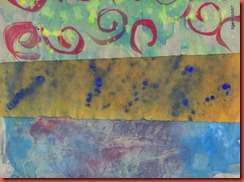
I used gouache, acrylics, watercolours and ink, on high quality office paper, the backside of old posters, brown paper (Kraft-Papier), tissue paper and watercolour paper.
I started with cool blue and red and added other colours as I went along.
I dripped colour on wet sheets, let the colours run, used the mark making instruments from the first activity to create patterns, rolled over the wet colours with a foam roller to spread them. I often made prints from a very wet sheet, folded and kneaded the wet paper to create colour mixtures and patterns.
Some of my first sheets
 |  |
 |  |
 |  |
4.2 Complementary colours: some examples
 | I used wet clingfilm (from sheet on the left) with drops of colour left on it for a print (right) and added a coat of light blue. |
 |  |
4.3. Analogous colours: some examples
 | 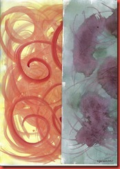 |
| Acrylics stippled on dry paper, printed, washed with clear water, rolled over with a sponge roller (right) | Above left: gouache swirled with a brush right: ink dripped and swirled with a glass nib |
 | 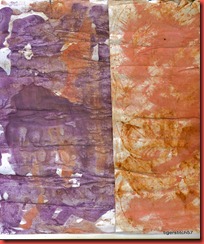 |
| Left: blue and yellow ink applied with a dropper Right: wavy stripes brushed closely on moist paper | Gouache dripped in stripes on wet paper which was then rolled and folded. |
4.4: Colour some pages in the sketchbook
I liked the cling film technique very much and used it for pages in my sketchbook (upper right; below: same technique with watercolour in my A5 watercolour sketchbook).
Upper left page: gouache ground in yellow with red drops, swirls of yellow ink applied with a glass nib.
 |  |
 |  |
There is no end to this … and always an enjoyable way to use leftover colours! You can see more examples of the papers in the next chapter.
Chaper 5: Stack, cut and stick
5.1 Create a design by cutting a paper shape into segments
My first shape was taken from this photograph of a peach. I thought a simple shape would offer a lot of possibilities for cutting.
 |  |
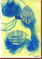
I also took the shapes of a lemon and of a bell pepper.
 |  |
 |  |
I like this shape on the right a lot, it looks like a silhouette of trees against a sky. |  |
 | The “leaf” is the lemon shape again – very versatile. |
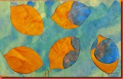
Cutting shapes from the coloured papers left me with some nice negatives.
 |  |
 | I added my favourit cut-out shapes and put the sheets into my sketchbook over the coloured pages. |
5.2 Cutting layers for design
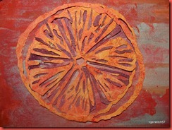
For this activity I chose the lemon I painted at the beginning of the course. I thought the segments of the fruit would make a nice intricate pattern.
 | This is the tracing of the original image with a little simplification. With a violet and an orange paper I tried out several backgrounds and arrangements. |
 |  |
 |  |
Different arrangements:
 | 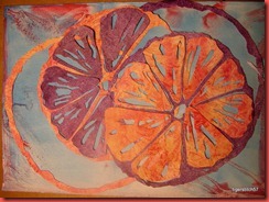 |
 | I got so caught up in arranging the pieces that I forgot to take photographs for some time. The left arrangement is the one that ended up in my sketchbook. |
Extra activity: Repeat with more papers
I had two photographs in mind and could not come to a decision, so I used them both, the first with three and the second with four papers plus background.
 | 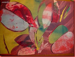 |
The second motive and its variations:
 |  |
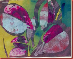
| Above: final design These are more or less the true colours. The photographs were all taken in artificial light and look more yellowish. | |
 |  |
 |  |
This design was much too complicated. I felt that the distribution of the red and blue pieces was the most important feature, so in the end the process became like painting with the pieces. At this point it was handy to have so many of them. And I have acquired some skill with the cutting knife!


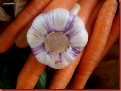



Keine Kommentare:
Kommentar veröffentlichen