3.6.1 Tearing papers in different ways

| Newspaper torn with the grain |

| Newspaper torn against the grain |
| |

| Office paper torn with and against the grain. |

| Light watercolour paper (160 g/ square meter) torn against the grain, with nice broad edges. |

| Same paper torn with the grain. |

| A sheet of recycled wrapping paper, there is hardly any grain at all, as the fibers are short. It is very easy to tear in all kinds of shapes. |

| Shapes torn from different papers pasted on two opposing pages in my sketchbook. The right page was covered with gesso first. |

| Ink wash (Winsor and Newton Sunshine Yellow) on the right page. I like the way the white paper shapes show up as the torn edges soak up the colour. |
 | I covered another page with gesso, pasted torn watercolour paper and the lining of an envelope on this layer. Then I painted stripes of gesso over the page and finaly an ink wash of red wine ink (a local product, smells nicely of wine). It was a quick tryout to see if this would work, and the composition is not exciting. Something to be explored further on. |
3.6.2
Viewfinders

I have used the two L-shaped pieces on the left for some time, also in this activity. The square (8,5x8,5 cm) and the rectangle (8,5x12 cm) were made according to the instructions in the module. I am looking forward to going out and using them.
Collage landscapes

|  |

| I first traced the whole photograph to see how the stripes looked like and made enlarged copies of the area I had chosen with the help of the viewfinder. |

|  |

| Same procedure here. I chose the lower left corner of the tracing. I had fallen in love with the papers (gift paper and self-coloured paper), so it is more about them than about the design. The white edges are well for the foam though. |
 | 
|
 | Here I worked from a small photograph and enlarged the tracing, which left me with fewer lines than before. I tried to match not the colours, but the tones as closely as possible. Still, the colours are surprisingly alike. |
In the foreground the white lines of the torn edges did not fit in, so I cheated and painted them over carefully with bistre ink.
Tryptichon
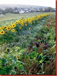
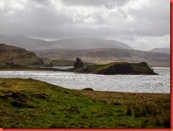
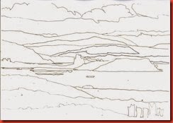
My source and a copy of the traced page – much worked on, as you can see.
I thought for a long time about my choice of papers. In the previous example I had worked with muted, soft colours, which worked well for the photograph taken on a rainy day, but now I wanted to try something different. I chose strongly coloured papers – reproductions of paintings from a calendar, done in deep, intense acrylics, and gold-coloured gift paper. The foreground was cut from an old envelope in ochre, papers coloured with acrylics and cling film, and I made pastels for the sky and the mountains. So I ended up with strong contrasts: papers with patterns against blank papers, smooth surfaces against shiny ones, dark areas against light ones. I had been worried about neglecting the tones, but I like the result. Looking at the three pieces I remember that sunny day.
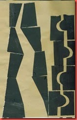
A few weeks ago I picked up a brochure with a painting that seems to fit in with the work in this chapter (and the next). It was done by the German expressionist painter Karl Schmidt-Rottluff.
I like the way he suggests trees and landscape features by creating patterns within the stripes.

